It is very important to have a trick to make customers “HIGH-TENSION” in this time period of that the web becomes the commercial space.
There is a building, Bunkyo-Ku, Tokyo, standing on the upland around the University of Tokyo, Hongo campus. The 2 floors of the building are the place that the around 200 people are full of energy. This is the office of “teamLab” strongly insisting as “the ultra technologist group” by engineers, programmers, and designers. The president is Toshiyuki Inoko who becomes an opinion leader of his generation. He is different from presidents of other venture companies as he lists “Rebirth Japan” on the purpose of establishing his corporation.
teamLab is known as not only official works that IT specialists do but activities of digital artworks. The reason that they got spotlights from the world is the installation work in “Kansei Japan Design Exhibition” for 150th anniversary of the relationship Japan and France at Museum of Decorative Art of Paris in 2008.
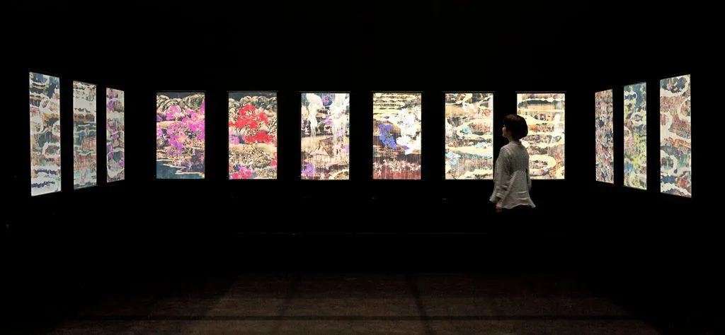
Inoko says, “I want to make contents that can feel thought and beauty of Japan because the purpose of the project is to inform Japanese products to the world.” What they thought for this was making the space full by putting 12 LED display monitors, 2.7m high, in row, 12 channel sound systems, and their independent films.
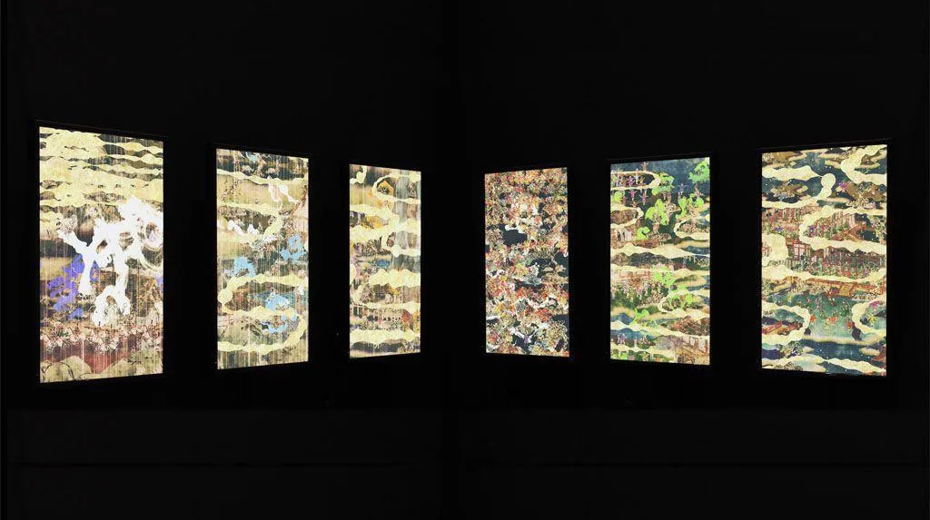
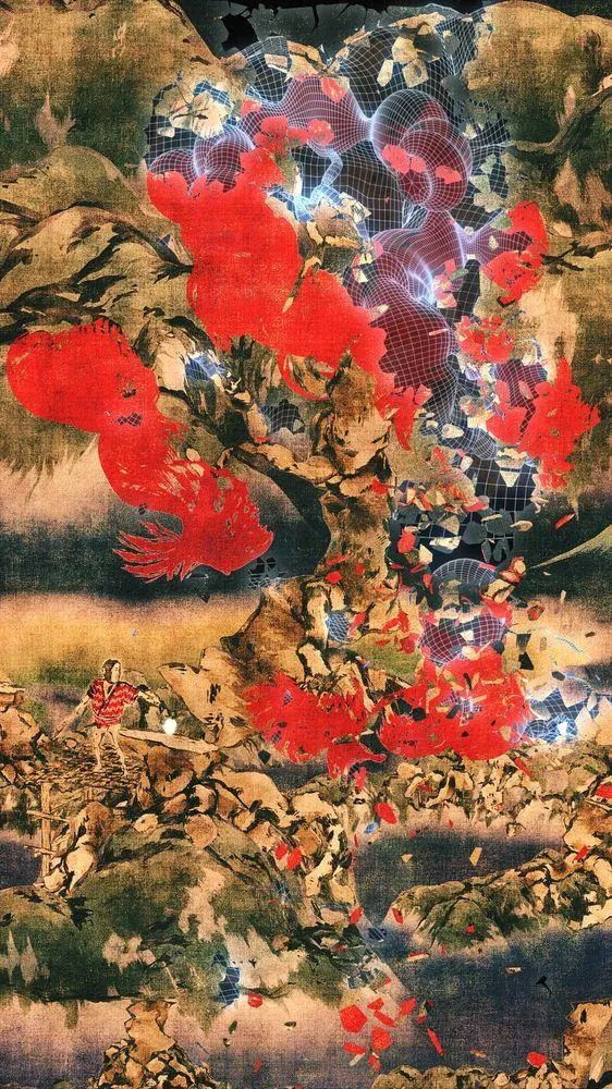
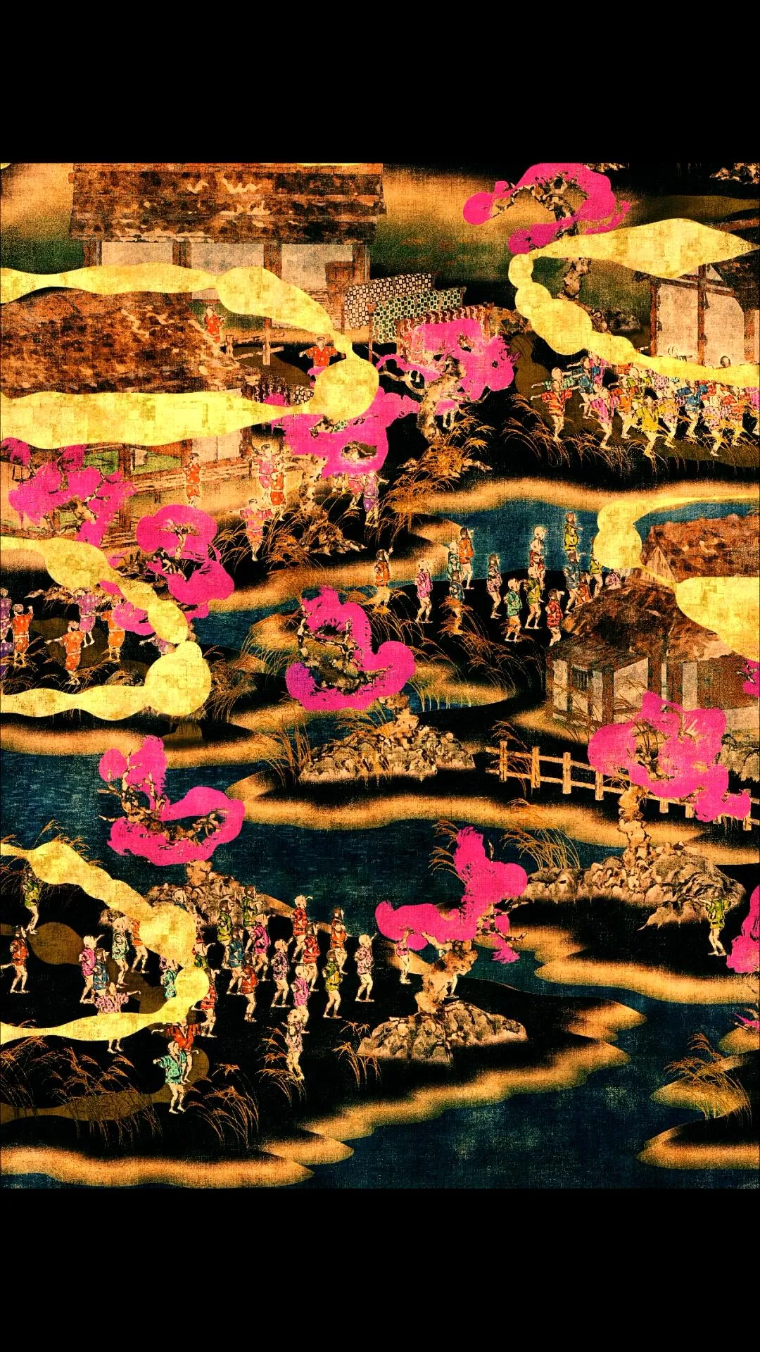
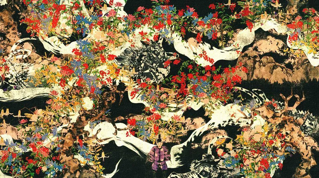
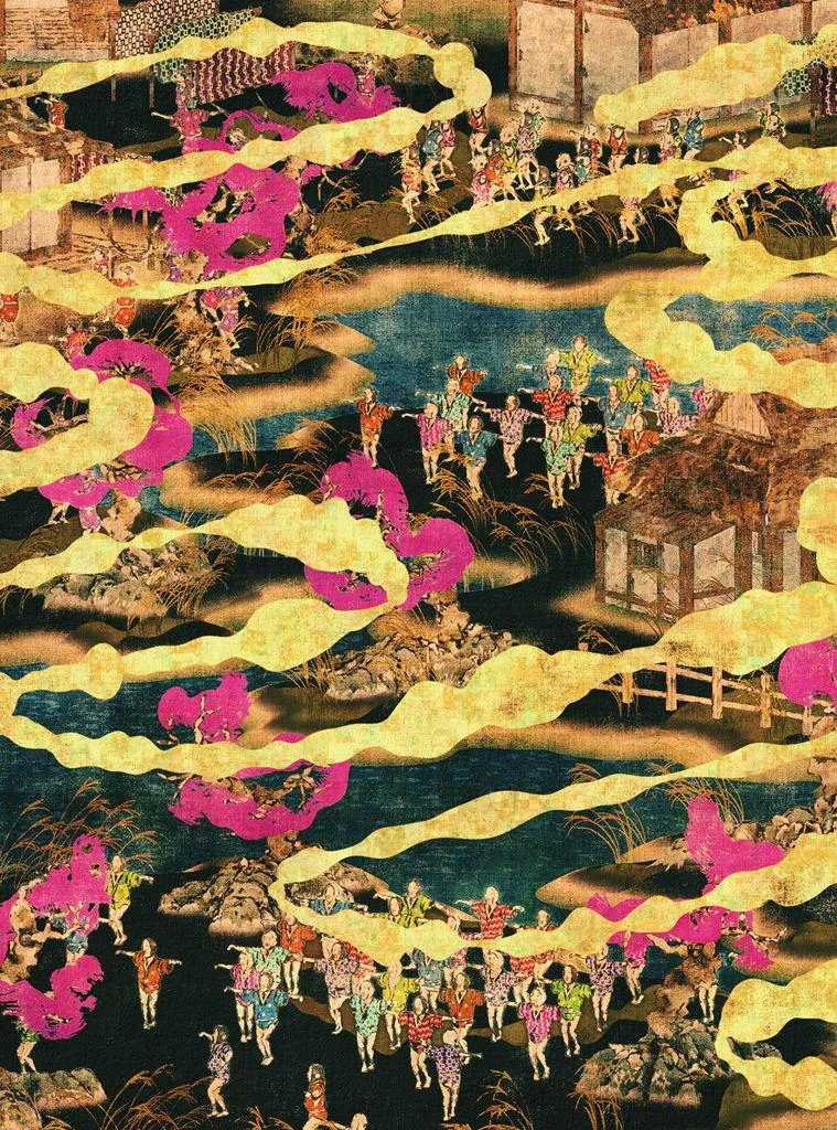
The films were “Flower and Corpse” which is their original video art. The stages in the screens that may make people think of picture scrolls from Heian period are created by 2D which is rebuilt from a 3D world of imagination on a computer. This is cut out by 12 points of view. The purpose of this work that looks like traditional Japanese painting is not showing Japanese traditional taste. Inoko says, “Because I want to know how ancient Japanese people catch sight of the world.”
The space expression of ancient Japanese that doesn’t constant their visual point to one, not like thinking of perspective of Western way, is “It should have good compatibility to the commercial space” as Inoko says. And he continually says, “The 20th century films are the things that force us to watch them from one visual point by sitting in front of the screen in a theater or TV. But the Japanese way is better if the space itself can be full of films because it won’t fix people’s visual point. Then you can be freely walking around in the middle of films.”
The instance is the video art “100 years sea”, 23m wide, at Konica Minolta Plaza in Japan and Yokohama APEC in 2010. The film, representing rising of sea level during 100 years, was projected to three side of wall. It was possible to have immersive feeling even though it didn’t give feeling of depth. The corner where the wall and wall meet was hard to see the line of the joint. It looked like a folding screen painting. When a world or story needs to be shown by a space as media, it seems to be one of the possible choices to approach.The interface: No way to feel its behavior.Inoko and core members of teamLab are the people of the generation that experiences information revolution from the late 1990s when they are students. The experiences from the time they put themselves in the world of web business for a long time by starting the business on since 2001 are related to the question like, “why a space is only designed as material itself?” Their idea that using a space as media itself making full of films may lead to the way of the value like “More mass, less cool.” (as Inoko says)
It is interesting what kinds of thought about the commercial space they have as who are looking after managing the EC (electronic commerce) site. “EC site is proceeding better way than real stores in the some ways like recommending goods from the history list the customers have been bought, showing tons of goods in the once, and so on. What if real stores and web stores are using the same platform? It is probably possible to present a space by information itself as the web sites do.”
At first, they exhibit “teamLabHanger” at the booth of apparel brand called “earth music & ecology” in “Tokyo designer’s week 2010.” If customers take the hanger on their hands, the sensor that is attached to the hanger starts to work with the display screen right next to the goods and a picture of a model whose holds or wears the goods and shows up with its information. “The trigger is the idea that we want to make an interface from common behavior. When people try to connect a commercial space to an information space, people need to learn new behavior or have one more step. But we want to make the conclusion as the natural behavior that people are holding a hanger on their hands to see a cloth. The reason that using the picture of coordinating clothes is from the experience of managing EC site. The sales cannot even compare to sales of when using a normal picture because they were big difference.” (as Inoko says) One more exhibition is “DIGITAL SHOW WINDOW system” of signage that is for outside of a store. It has a feature to be able to use logs from users connected to teamLabHanger. For instance, the picture of goods that is taken up a lot by customers is displayed on the monitor in 5 minutes as it is ranked. Even though it is not totalized or analyzed by POS, the history of users itself becomes other’s contents. This is the one using the way of web.The evolution of a space like a web and product do.teamLab sometimes works on artworks using films and sometimes works on the business by using technology. It seems to have no connection between them, but Inoko explains, “Our expression and system may be looked like different things, but they will be ended up with one thing. Now it is just on process.”
“Digital media has a feature of that the front side users can see and the back side that system is running are related. We have been working on those two sides on web. We think it has been separated to the shown side and technology side. If we are making a car, engineers make an engine and designers make a design. However, in the case of a cellphone, for example iPhone, it is hard to tell which parts of works are for programmers and which parts of works are for designers to make its interface. It is hard to think separately between expression and system to make a product as same as a web. And I think a space will be so in a some day.” (as Inoko says)
Not only In an information space but also in a real space, the front side work, design, and the back side work, system, will be one. When the day comes, what is possibility that the commercial space has.
“The people who purposely comes to the store want to have ‘physical feeling’ can get from only that place. It is not in a virtual world. It can be exciting entertainment. If it is hard to win from a web in logical way, we must do something to make customers ‘HIGH-TENTION.’ The way can be a cool design, interaction, or story. I think we can choose the way up to its condition or situation.”
